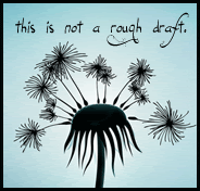
Yes, that's right. My blog got a facelift. Do you like it?
I'm loving it! It's so clean and perfect. Isn't it easier to read with the white background? Do you like the cool font? I'm incredibly thankful to Sharnee over at Acorn Glue who designed it for me. The artwork was a template she made long ago when her business was called by another name, and I asked her to customize it a little for me. She's incredibly patient--and I mean, incredibly!--to your creative wants and also very inexpensive. She's also Australian and says lovely things like, "Cheers" at the end of emails, which I love.
She's set to make me a button next so anyone *ahem* can post it on their blogs and websites, too. I'll be sure to post that when it's done. (I just saw that she posted that she's burnout on Acorn Glue. I am positive beyond a doubt it's from my comments such as, "Can you make the title go this way? Now this way?" I'm a nightmare client; it's true.)
Thanks, again, Sharnee!
Friday, June 19, 2009
Subscribe to:
Post Comments (Atom)


5 comments:
Looks good! I love the "write" background! :) Yeah!!! v. fun!
ahhhh!!! I'm going to fix that typo! Thanks, MK.
It looks so pretty!
nice. clean. good.
Love the new look!
Post a Comment